As an architectural element, nothing is more inviting than a bay window. It’s literally like basking in your own personal terrarium, a guest of the concentrated, surrounding sunlight of the day. Traditionally, bay windows are quaint elements furnished with only a long, cushioned seat fit for the single lazy reader or the family cat. We feel, however, these luminous habitats are suitable for much more: their warm, encompassing ambiance should be amplified and celebrated.
By enlarging these fanciful devices, we create spaces that can house entire seating groups, casual dining areas or bathing rooms. Suddenly there is room for all in the coveted window seat. These ports in the storm can now harbor more boats.
On the exterior of the house, these architectural accessories become glowing lanterns at night, light spilling out into the evening. Like moths to a flame, we are unconsciously drawn to these beacons.
The napping cat suddenly has company.
Faithfully,
Greg Tankersley for McAlpine Tankersley
There are those who think money is essential in creating something architecturally beautiful. Elaborate finishes, rich materials and custom elements do ratchet up building costs but one need only look around to see that pricey elements are also attributes to a lot of ugly.
I posit that what sets the graceful and beautiful apart from the awkward and homely does not have a price tag attached to it at all. Any thing of great loveliness possesses three magnificent qualities: composition, balance and proportion, none of which cost a dime. To the common eye, this essential triptych of good design goes beautifully unseen. You just instinctively know when something is pretty or looks perfect. These are the mystical tools of any good artist, sculptor and architect whose adept eyes and hands can take basic elements and alchemize them into something extraordinary. This creative orchestration – not monetary expenditure – is what actually separates the sheep from the goats.
Stepping off my soapbox for a moment, I’d like to show some examples to explain how one can see these essential design elements in a piece of work.
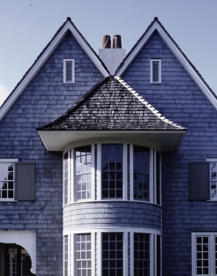
The street elevation of this house is an excellent case of how a simple orchestration of elements can create bold imagery. Here, the main gable is squarely anchored by a grand second floor bay window. This bay is made even more lofty by the squatty humble door assembly below – a playful game of proportions. This strongly centered balance is at once thrown off by the lilting roof to the left. Finally, the two small windows (one on the first floor and the other on the second) act as perfectly placed pieces in the composition, tilting the scale to bring the entire formation into balanced harmony.
The prior example was a simple composition exercise; this one is a bit more complex. It is interesting to note, though, that the same basic elements are used – beautiful music is still desirable whether your stage contains a quartet or a full orchestra. In examining this house, the front contains three strong elements – a powerful central gable, flanked on the right by a thin, soaring chimney and a an assembly of stacked windows to the left. This whole composition is a play of proportions – take for example the tiny windows hugging either side of the chimney, almost like children hugging close to their parent. Balanced in the middle of the gable, the enormous stair window sits atop a tiny slit window. Throughout the design of this house, whenever a grand gesture was made, an apology immediately followed. Here, asymmetry, with a nod to symmetry, leads the conversation of civility and balance.
I’ve been speaking of using these elements in the design of a house but, since they are artistically universal, they can also be used in interior design. Take for instance, the above vignette. The strong presence of this Italian desk is paired with a tall, wiry floor lamp – a play of proportions – think Mr. and Mrs. Jack Sprat. The robust symmetry of the desk is then asymmetrically balanced by the grouping of gilt candlesticks on top and a pair of vases on the writing surface. A small painting and book act to further visual equity. Finally, an upholstered stool weights the top-heavy composition to the floor. All is now right.
Look around your life. I’ll bet whenever you come across anything pleasing to your eye, whether it’s a building, a room, a painting, a sculpture, a furnishing – anything of design- it will undoubtedly be a masterful assembly of composition, balance and proportion. You can’t put a price on this. These unquantifiable components are indeed priceless.
Faithfully, Greg Tankersley for McAlpine Tankersley
Bobby McAlpine and Susan Ferrier are like an old married couple, often finishing each other’s thoughts and sentences. It’s no wonder their built collaborations are often so seamless, resulting in a body of work celebrated by some of the top shelter publications in the world. On Thursday, January 30th, the public will get the rare opportunity to crawl into the minds of this creative pair. Bobby and Susan will be sharing the experiences of their combined efforts at the esteemed Cathedral Antique Show in Atlanta, Georgia. Tickets are available here. It’s bound to be an exciting experience to see and hear how architecture and interior design can work, hand in hand.
Available soon is the duo’s first collaborative tome, Art of the House: Reflections on Design from Rizzoli Books, available for pre-order on Amazon.
Faithfully,
Greg Tankersley for McAlpine Tankersley
We always like to celebrate the anniversary of our blog “Finding Home” with a giveaway – a chance for our readers to grab one of our brass rings (well, usually they’re paper but we hope they have value to our fans). So, to honor our second anniversary, we’re offering the chance to possess a rare McAlpine Tankersley item. We published this little book Finding Home (coincidentally that’s where this blog obtained its moniker) about 10 years ago to celebrate our then 20th anniversary. It was a self-published tiny tome – its pages comprised of sepia photographs of our work and Bobby’s poetry. Originally it was given out to our clients as a humble thank you for their years of patronage. I can’t tell you how many requests I get from folks who want to buy one of these. We only have two or three left and I was able to sneak one out of our business manager’s clutches. Barbara Sallick, the founder of Waterworks, tells me she keeps it on her bedside table and even honored it on her blog.
Leave a comment below and this minute treasure could be gracing your bedside table.
Faithfully,
Greg Tankersley for McAlpine Tankersley
Each house we design and draw is a work of art, handcrafted in its detail. We often refer to the houses we design as bespoke, like a custom tailored outfit: a dress or a suit. Just as every house needs a bedroom, bathroom and a kitchen, every suit has sleeves, buttons and collar. Each bespoke suit is made to fit the wearer and every house we do is crafted for each of our clients.
We often find ourselves taking the analogy further. Each house can be discussed in anthropomorphic terms – relating it to the human body or figure and even how we dress our bodies.
When you are out on a porch, enjoying the view, the porch roof should sit down low, like the brim of a baseball cap over your eyes. Perfect for a sunset and a cool drink.
An animated thatch roof sits on top of a landscape folly like a hat, one perched playfully and dramatically on top of a graceful head.
Chimneys or parapetted gabled ends of a Cape Dutch house have shoulders. Nobody wants to see slouching shoulders on a person, so these house “shoulders” should appear relaxed but strong, graceful but confident.
The rafter tails along the edge of a roof should always sit down on top of the doors or windows under the eave. If not, it will reveal too much “forehead” above the doors. That would be like wearing a top hat tilted back at a 45 degree angle on your head.
Houses will sometimes have projected bases or watertables that act as a “belt” around the façade. The human body can look disproportionate if a person wears their belt too high, or too low, or cinched too tightly. A house is the same – its belt will allow the base below to be grounded, while the body (or torso, if you will) above is elevated and accentuated.
Landscape walls and stone bases are meant to be like flared pant legs, or pants with a cuff, providing a connection to the ground that is stable and organic.
Some houses, like their owners, are meant to be tall, slender and elegant. Other houses are low and humble, rooted to the landscape, salt-of-the-earth and kind, just like their owners.
Every client has their distinct personality and style; so too their house. Art and life are entwined in each drawing and design.
“Ars imitator vitae. Ars vitae.”*
Faithfully,
John Sease for McAlpine Tankersley
*translation: “Life imitates art. Art imitates life.”
Congratulations to commenter Jan Hoenk, the lucky recipient of last week’s giveaway! A copy of our little book, Finding Home, is on its way to you.
One of the great things about our profession is that we receive invitations to design projects of all sizes. The ingredients of any abode are basically the same – shelter, living, sleeping, bathing. Sometimes the bowl we mix them in is considerable – oftentimes it’s small. A commenter on a recent post requested I spotlight a few of our more diminutive concoctions. I’m happy to oblige.
This house is located in the bucolic West End neighborhood of Aspen. Adjacent to downtown Aspen, the West End district is composed primarily of narrow lots which once housed modest “miner’s cabins”. Over time, many of these humble cabins have been leveled to make way for more modern dwellings. This Victorian inspired cottage is probably one of our narrowest- at its widest point it’s a mere 24 feet. Given the stringent restrictions of land use in Aspen, available square footage is severely limited by the city. Although this certainly holds back the designer’s hand in terms of space, the end result is a miniaturized scale maintaing the charm and quaintness of the area. This little gem comes to a total of less than 2,000 square feet of heated space above grade.
Cindy Smith, an interior designer in Charlotte North Carolina had been searching for years for a lot in in the tony area of Meyers Park. As often happens in popular neighborhoods, property was difficult to come by. She finally stumbled upon someone who offered to sell her a portion of their rear yard. This street-facing property, a whopping 60 feet wide, held much promise in the imaginations of us like-minded designers. Unburdened by the needs of suburban garages and mudrooms, Cindy envisioned an urban French townhouse with a gravel motor court delivering you right up to the oversized front door. Upon entering this 38-foot-wide placard of a house, one traverses along the length of a two story light-filled side gallery which serves as circulation and dining – proving that even small packages can be a host for great drama.
The previous examples were certainly made small by site limitations. This cabin, on the other hand, had vast property at its disposal; its needs were merely modest. A weekend house situated on a gentleman’s farm, this minute dwelling serves up humble comforts but offers them regally. Nestled beside a lake in a soft-spoken manner, this little lodge sought to elevate simple camping to new heights.
Faithfully,
Greg Tankersley for McAlpine Tankersley
As you know, we’re in the business of design. As designers, we rarely sit still – the chair we sit in always seems to be moving about the room.
A few months ago we gave our website a total makeover. Today, I’m happy to announce our blog, “Finding Home”, has also received a new look. I’ve got many exciting new articles, thoughts and shares in store for 2014.
I hope you enjoy our digital renovation. Look around and please come back for more of our ramblings. We strive to learn on our passionate journey and are delighted to share our thoughts in creating the “inheritable house”.
Faithfully,
Greg Tankersley for McAlpine Tankersley
The following article, a design for a family house in Birmingham, Alabama, appeared in the January issue of Veranda magazine. We are reprinting it with their kind permission. As a bonus for our blog readers, I’ve included some of our original design drawings of the house. The article was written by Mimi Reed and photographed by Mali Azima.
Designer Susan Ferrier reacts to strongly masculine architecture like a grande dame storming a men’s club. Give her empty rooms composed of virile materials and strict, cerebral grids, and she’ll treat them with furnishings that are boldly voluptuous, a tad rustic, and movie-star glamorous.
This gracious stone residence in Mountain Brook, Alabama, is a case in point. Designed by the renowned residential architect Bobby McAlpine, who has been Ferrier’s working partner for 15 years, it was inspired by the area’s rich inventory of beautifully wrought, 1920s English-style houses and cottages.
Built in 2011 for a young family, the house features an H-shape plan with spans of handmade leaded windows that offer views from the front door to the back gardens. Tactile finishes, like wire-brushed oak floors, abound, and a 25-foot-square, double-height living area will probably smell like a cypress sachet forever.
Ferrier began her feminine siege just inside the front door. “I wanted it atmospheric, soft, a little bit foggy,” she says. “A house is not just visual—it should be sensual.” Concrete tile flooring convinced her to lay down a white goatskin rug that seems like the height of impractical decadence, until she explains that goatskin is full of lanolin and stays clean even if you tromp on it in muddy boots. She installed an eccentric hooded chair as sentry, covering it in lustrous blue silk velvet.
Besides designing rooms in which you want to touch everything twice, Ferrier is known for creating spaces of great scale. “I like large, quiet things as opposed to small, chattery things,” she says. “They’re like bass notes in the choir.” In decorating the dining area, she was thrilled when she found an enormous, graphic iron chandelier to hang like a great galleon over the table. “Everyone thought it would be too big, but I said, ‘Wait until the furniture arrives. Then you’ll understand that a light fixture has to relate to the architecture and not necessarily to the furnishings.’”
Corinthian capitals made into lamps anchor the room, adding patina to this sweeping space that is open to a salon-style living area and, off to the side, a slightly richer, more reserved lounge overlooking a terraced backyard.
Ferrier saved some of her boldest moves for the master bedroom, where the colors are delicate but the scale is decidedly not. She curtained the bed on three sides with miles of creamy velvet so that despite all the windows, the homeowners can sleep in total darkness. An espresso-brown headboard makes for a strong contrast, as does the long silk taffeta pillow in stormy gray-blue-green. “I don’t know what to call that blue—maybe it’s the color of labradorite,” she says finally, with striking precision.
Of course, Ferrier’s rooms have to have a small dose of sparkle. At the foot of the bed, a sofa shimmers in pinstripe velvet, its small pillows trimmed with metallic Indian embroidery. Pulled up to it is a silvery faux-bois table with crystal orbs cupped in its branches. Exuberantly personal, this table could be gratuitous bling in someone else’s hands, but Ferrier uses it like a piece of fine sculpture.
“I can hand her a house that’s as masculine as an English humidor,” McAlpine says, “and she will find the glamour and femininity to lift it out of the swamp.”
What is it about outbuildings that cause such a broad smile? Their quaintness always elicits a contented response. Maybe it’s because, unlike us, they are unburdened by the stress of program. Free from the tedious load of daily need, these follies soar in imagination and invariably charm the landscape.
Situate these enchanters near a lake or bay and their allure increases as they echo across the water’s mirror surface. Their reflections become both literal and meditative. Finding refuge in these structures is a serene joy; their simple offerings harbor the soul and calm a troubled mind.
So prop your feet on the rail, gaze over the water and know solace indeed. After all, nature’s basins are excellent brain washers.
Faithfully,
Greg Tankersley for McAlpine Tankersley
I’m the proud dad of a sixteen year old girl. She’s also a high school junior. This week I’m spending her Spring Break, not by swatting away teen boys at a Florida beach, but by touring potential colleges. While car tripping up the Southeast coast, my wife and I have become decidedly amused by the college tours. As a matter of fact, our eye rolling is beginning to rival our daughter’s. We’re of the age where we were thrown by our parents into college with the old-tried-and-true-sink-or-swim method. Welcome to the university of hard knocks! These days (I feel old even typing that), colleges feature coddling amenities that rival posh country clubs or four star hotels. Cafeterias boast vegan bars, helpful personal advisors are around every corner and dorms are outfitted with appliances per your pre-arrival on-line request. Hundreds of clubs and “interest groups” exist to make sure your little darling feels involved and comfortable. I’ve learned about classes ranging from Harry Potter studies to artisinal chocolate tasting. And, if all this becomes too stressful, there are therapists on staff to help your child deal with the pressures of college life.
I suppose times have changed. In general, our generation has grown up more privileged than our parents and we expect we’ll pass it on. As a result, the little ones have been offered a lot during their short stint thus far on the planet. Whether that’s better or not I’ll not get into, because this is a blog about design, not sociological implications in current culture. Therefore, before this post wades too deep, I’m sharing some of the kids’ rooms we’ve had fun designing. Sometimes our smaller clients offer the bigger challenges.
Now, I’m off to tour another college yoga studio.
Faithfully,
Greg Tankersley for McAlpine Tankersley
Thomas Jefferson famously quoted “I cannot live without books.” After visiting his famous Virginia home, Monticello, I witnessed firsthand evidence of his obsessive literary surroundings. Every available wall of his personal library was papered with a lifelong collection of books. He obviously required a nest feathered with reams of studious volumes.
Today, we’re blessed with such technology that allows us to carry hundreds of books in what amounts to one good sized pamphlet. Your library can literally reside on your bedside table. Why then, do we seek to litter a room with archaic books? Do we just like to dust? Most clients come to our initial meetings with a program – a list of rooms they want in their new house. More often than not, that list includes a library. I’ve found there’s a romantic notion in this request; it’s much more than a functional repository for the inevitable tomes we accumulate merely by living long enough. I feel most of the books we lug in all those oh-so-heavy boxes throughout our lives represent important touchstones. Lining a den with these seem to offer great comfort. These are bits of information, memories, entertainment and images we’ve deemed crucial enough not only to read, but to hold onto and cherish. Surrounding ourselves in a tangible collection of recollection and reference is like putting on an old coat – intimate, familiar and warm.
What is a library but a learned, informed and inquisitive mind made real? Immersed in the millions of words that have formed us over a lifetime, we find comfort and solace in a life well-read.
Once there, we kindle the hearth and sit down with a well-worn friend to fire the imagination. And it’s not with a Kindle.
Faithfully,
Greg Tankersley for McAlpine Tankersley
Most of us who were raised in warmer climates during the golden era of the ranch house know exactly what a “carport” is.
For those unaware of this unsightly, but useful appendage, it’s basically a structure that allowed a car and its inhabitants to pull under cover, leave the confines of the vehicle and enter the house protected from inclement weather. Think garage with no walls. In the South, these often doubled as sitting porches when the car was away, further adding to their sophisticated appearance.
These gaping car maws (usually located on the front of the house) were handy but not much to look at. Oddly enough, these auto deposits actually have an historical source. Porte cocheres (just the French translation makes it sound classier) were porch-like features of late 18th and 19th century mansions which permitted a carriage to pass under allowing the occupants to alight under cover. Using a salad dressing analogy, something obviously went wrong on the road from French to Ranch.
The automobile still tries to dominate the design of houses nowadays. As a matter of fact, the three car garage has become de rigueur. These annexes, however, tend to be elephantine in size and often dwarf the mass of the house itself. To overcome this, we often delegate one car to a porte cochere, allowing a more appealing and proportional two bay carriage house.
Most of our on-the-move clients really come to enjoy this casual auto drop-off device. It tends to create a breezeway at the front of the house and lends an air of open friendliness to the proceedings.
Following are some examples of our “carports” – a far cry from their suburban ranch roots.
Faithfully,
Greg Tankersley for McAlpine Tankersley
The following article, a design for a family house in Birmingham, Alabama, appeared in the March issue of Southern Living magazine. We are reprinting it with their kind permission. As a bonus for our blog readers, I’ve included some of our original design drawings of the house. The article was written by Mimi Reed and photographed by Laurey W. Glenn.
Sometimes, designing a house is less about conforming to a graceful picture in the mind’s eye and more like solving a giant Rubik’s Cube. Such was the case when architect Chris Tippett, a partner at McAlpine Tankersley Architecture, took on a new house project for a family of six who had outgrown their nest. Because they adored their neighborhood—a dappled, woodsy area of Mountain Brook, Alabama, that was lined with cottages and threaded with walking paths the couple decided to raze their existing house so they could build a new one on the same site.
Cramped and pie-shaped, the lot afforded an almost impossible footprint due to its size and shape as well as stringent new zoning codes. None of this fazed Chris. He came up with a telescoping floor plan that’s wider at one end of the lot and becomes narrower as it reaches the lot’s point. He decided that this eccentric shape looked best clothed in a clean, contemporary rendition of the late 19th-century style known as Carpenter Gothic, a vernacular tradition wherein house carpenters improvised features that were originally carved in stone in authentic Gothic architecture.
Like the exteriors of old Carpenter Gothic churches, the house Chris designed has steep gables, vertical board-and-batten siding, and closely grouped windows. Clad in clear cypress boards with a faded opaque stain, the house continues to weather and will only get better over time. “You get to see the character of the wood—the graining of it and the variety of each board—but when you step back, it all works as a cohesive whole that’s very relaxed and soft,” Chris says.
Inside, the decorating celebrates the architecture. Despite having young children, the homeowners wanted rooms with a sophisticated look. Designer Susan Ferrier of McAlpine Booth & Ferrier Interiors created her signature world of rustic elegance while leaving plenty of open space for horseplay. She used a lot of ivories and golds, taking the rest of her color palette from the roof tiles outside—slate greens, blues, and grays. Every room is a spare but sumptuous still life layered with textures and bold scale. “I prefer using large pieces, which calm and ground a room,” says Susan.
Because of the floor plan, some rooms had to do double duty. In the dining room, which is also the foyer, two iron carriage lanterns float over the table like giant armatures. Below them, an assortment of straight-backed chairs of varying heights and two custom benches give the room a lively skyline. Another grand-scale gesture is the breakfast room’s 141/2-foot licorice- colored banquette, part of another compelling community of seating pieces that flank a gracefully attenuated oval table.
In the living room, Susan made a stunning marriage of opposites. Over the masculine grid of windows, she hung a large carved mirror that looks like a coat of arms crossed with a Rorschach test, if both of these things were also endowed with voluptuous feminine curves. “It’s a fabulous silhouette—definitely the focal point of the room,” she says.
Throughout the house, the furnishings have strong, purposeful lines, and ornaments are calming and tactile. Upholstered pieces are covered in textured velvets and linens, many with bronze nail-head trim for a faceted, low-key sparkle. “It’s soft, warm, and honest,” Susan says of the house. “You can feel these textures with your eyes, and in that sense, the interior is like the architecture—the opposite of slick. It’s not just visual; it’s sensual.”
Architect Bobby McAlpine and Interior Designer Susan Ferrier will be the keynote speakers at Atlanta Decorative Arts Center Tuesday, April 29th. The event begins at 1:00 PM. The pair will discuss their multiple creative collaborations as well as their new book from Rizzoli, Art of the House: Reflections on Design. Copies of the newly released book will be available for sale and signing immediately following the talk.
As a twist, Bobby and Susan will be breaking the “talk at you” format typical of most presentations and will, instead, be asking each other probing questions. This casual chat between friends will give the audience a voyeuristic ear into the alchemy that happens in the design process. Having spent much time with these two dynamic personalities, it will undoubtedly be a fun and revealing session.
The new book spotlights five houses in detail, all of which are located at The Camp at The Ridge on bucolic Lake Martin, Alabama. Each house in this unique development is basically the same window lined wooden box with but a few variations on a theme. Individuality was expressed in Susan’s dramatic and eclectic interiors, each reflecting the singular spirit of the owner’s particular personality.
Faithfully,
Greg Tankersley for McAlpine Tankersley
Last week, Bobby McAlpine, Ray Booth, Susan Ferrier and I were invited to attend the annual summit of the Leaders of Design Council. Every April, top Architects, Interior Designers and Landscape Architects meet at an exotic locale think tank to discuss how to further our professions and better serve our clients. Previous gatherings (documented on this blog) have occurred in Marrakech and Berlin. This year, the site chosen was the Paris of Latin, America – Buenos Aries, Argentina.
What’s new Buenos Aires?
I’m new, I wanna say I’m just a little stuck on you
You’ll be on me too
My impressions of this vast, bustling city were varied. It certainly has shadows of Paris cast about – the ornamentations of the Colon Opera house, the sidewalk cafes and the wide, expansive avenues definitely lilt with a French accent. Their beef bourguignon, however, comes peppered with distinct Spanish spices. One need only wander the famed La Recoleta cemetery to see elaborate monuments to death that only Latin cultures know how to celebrate. Meanwhile, throughout the city of the living, splashes of color and rich gusto were rampant in every corner I turned.
Fill me up with your heat, with your noise
With your dirt, overdo me
Let me dance to your beat, make it loud
Let it hurt, run it through me.
Don’t hold back, you are certain to impress
Tell the driver this is where I’m staying
What touched me most was the absolute graciousness of the Argentinian people. Before the conference began, we had two opportunities to touch base with “friends of friends”. These phone numbers were but flimsy threads of contact, but we promised we’d at least ring to say hello. One, an architect and his lovely wife, the other a glamorous octogenarian, immediately insisted we join them in their respective homes to commune for dinner and champagne. These welcoming hosts were delighted to roll out their singular red carpets to us, visiting strangers. We were outsiders no more; our new friends offered gracious harborage that would rival any stateside Southerner.
Take me in at your flood, give me speed
Give me lights, set me humming
Shoot me up with your blood, wine me up
With your nights, watch me coming
All I want is a whole lot of excess
Tell the singer this is where I’m playing
The national dance of Argentina is the Tango, a sultry dance, at once poised, lusty and energetic. It’s no surprise that the word “tango” means “touch”. The people and their city embrace deeply, both in heart and mind. I departed energized, certainly by the inspired dialogue with my peers but also by the vivacity this city exudes.
Stand back, Buenos Aires
Because you oughta know whatcha gonna get in me
Just a little touch of star quality
The following photos are but a bit of the beautiful allure my eye captured. My heart and imagination was captured fully.
Faithfully,
Greg Tankersley for McAlpine Tankersley
The good old kitchen island is the hub and anchor of modern kitchen design. Acting both as workstation and informal gathering spot, this epicurean altar serves many masters and even more functions. But laden with such responsibilities, how do you keep the design from looking like the USS Intrepid has suddenly stationed itself inside your kitchen? The following are some examples with tips we use in some of our designs:
Cleverly break the scale down. Notice how the countertop slab is elevated slightly on stainless steel pins above the slab legs. This creates a zen-like, floating effect which gives the island some breathing space. Recess the storage underneath the island on all sides. This also allows seating all the way around, similar to a table. Decorative turned legs at the corners complete the farm table look. A differing countertop material on the island also can also eliminate “material exhaustion” typical of most suburban kitchens.
Break down the boxy appearance of a typical island by adding trestle ends. Also, an island should be no deeper that 5′-0″. That’s as far as you can comfortable reach the center to clean.
Here, the island was designed with completely different material than the rest of kitchen cabinetry. The lacy industrial steel ends and dark cabinetry visually lighten the piece. Three light fixtures over the island (as opposed to one large one) keeps things appropriately proportional.
This island was not only built out of differing wood than the rest of the cabinetry but was designed to appear as a furnishing. By eliminating bulky-down-to-the-floor-storage, we were able to keep this island light in tone but still useful. Recessed bin drawers located under the counter pick up additional storage.
Create a one-of-a-kind focal point. This iron and wood island was commissioned by us and manufactured by the artisans at Herndon and Merry in Nashville. An inordinate knee space depth helps keep this large island from appearing too bulky.
The knee space in this island was eliminated, allowing the island to be a narrow depth. To accommodate casual seating, an antique table with dining height chairs and stools have been silhouetted against the backside of the wood fluted island. This club-like grouping is much more social and comfortable than being perched, diner-style, on tall bar stools.
Use a piece of furniture instead. Kitchens rarely have good furnishing potential so utilizing a found piece gives a kitchen a collected and eclectic character. After all, the original island is the well-worn farm table found in most English manor working kitchens. Return to the roots with a real piece of furniture – if it was good enough for the staff of Downton Abbey, it’ll be good enough for your crew.
If you have enough real estate, go with two islands. This works really well in situations where there are literally too many cooks in the kitchen. It also allows great circulation where one large island may serve as a roadblock.
Have a kitchen with only islands. This unique kitchen (located at the end of a large open salon) is only equipped with a pair of islands. These islands were designed with elevated wood fluted screens which shield the rest of the room from inevitable countertop clutter.
The best advice I can give is to edit, edit, edit your kitchen island needs. If you can unburden the poor kitchen island of some responsibilities (i.e. storage), it can become a simple, elegant element. The less program the island has, the better it will be. How many zesters do you really need anyway?
Faithfully,
Greg Tankersley for McAlpine Tankersley
We’re very excited to announce our new book from Rizzoli publishers, Art of the House: Refections on Design, released last week. This new book focuses on five wooden cabins at Lake Martin, Alabama. The structures, part of the Camp at the Ridge, share basic architectural DNA but their interiors, all masterfully done by Susan Ferrier, are very different in style. Siblings all, but with their own distinct personalities.
I want to share how this particular book came about. One sunny morning at the lake, Bobby (who lived in one of the camp houses), noticed that the interior of his cabin held sunlight a certain way and that the accessories gathered took on an almost Dutch still life quality. Gilt objects, combined with rough firewood seemed to be made better by the other’s company. He contacted his dear friend and partner in his interior business, Susan Ferrier, and invited her and her husband, Adrian (himself, a part-time photographer with an equally keen eye), to spend the summer at the lake. As a summer camp “arts-and-crafts” project, they would assemble vignettes of artifacts and document them photographically. It wasn’t until after a few weekends of these sessions, that some type of book seemed to be forming.
Other friends assembled. Author Susan Sully and book designer Eric Mueller were brought to the lake lab to assist in raising this new literary child. Rizzoli, the premier publishing house who published our last book, The Home Within Us, was happy to take on this little pet project. In addition to these artful still lifes, the book also chronicles the cabins in full.
The results of this summertime craft project amongst friends is now polished, gilt-bound and available to share.
Faithfully,
Greg Tankersley for McAlpine Tankersley
There’s a magical moment that happens when you’re sitting in a theatre waiting for a show to start. Lights dim, conversation dies down to hushed whispers, the curtain raises and suddenly, you’re waltzed away to another place. In a house, a good foyer should create the same awaiting promise; as soon as the door opens, an act one scene should be expertly set for the play unwinding within. It’s the grand opportunity to create drama – aside from a place to step out of the elements and await invitation, no other program is required. Devoid of the burden of function, why not present a bit of theatrics while welcoming?
The console is the perfect furnishing for this type of space. This narrow piece, silhouetted against an entrance wall acts as a splendid serving platter. It presents forth, offering the visitor a visual buffet of treasures representing the character of the house beyond. The addition of a dramatic lamp illuminates the miniature stage.
It’s the antechamber to receive visitors, a spatial purgatory one must go through before entering asylum. The master or mistress of the house gets to daily play the role of St. Peter, welcoming (or turning away) the expectant visitor. If your home is your castle, the foyer is your drawbridge, congenial arms outstretched. Grace is held out and admittance is sanctioned.
Come on in. What may I get you to drink?
Faithfully,
Greg Tankersley for McAlpine Tankersley
A few weeks ago, the annual summit of the Leaders of Design Council took place in Buenos Aries, Argentina. I wrote about our experience here. Bobby McAlpine was honored to be one of the speakers during the Summit. He penned a poem about design that was a part of his talk. We’d like to share it with you:
Beautiful things don’t make beautiful rooms
any more than money makes you rich
or
facts make you interesting.
We’ve become shoppers
and name droppers.
Hoarders of labels.
Beauty exists when it takes you with it.
When it captures an emotion you starve for
or
a feeling you well know
or
a place you well know.
A place where you’d best exist
where it recognizes you.
Unbridled we are free to make manifest
places that exist only in our subconscious.
This is the state in whichall the things
we love came from.
When the world did not look like it should
to our hearts
so we made one that did.
These things, however magnificent.
pale
to what’s beneath them.
The call,
the ether,
the foggy accuracy
of
the divine.
How long must you wait
to have the emotional accuracy
within you
play out?
To walk through this world
in the knowledge of another
is to walk in your true inheritance.
How long must you wait?
This is the good question
I ask myself.
This is my reveal.
Bobby McAlpine
All Content on this Site is the Property of McAlpine Tankersley Architecture.
” How often have I lain beneath rain on a strange roof, thinking of home.”
William Faulkner
Years ago, I was working with a client and the topic of roof material arose. I started talking about all the options appropriate for her new house and she exclaimed “Before this discussion, I don’t think I’ve ever even looked at a roof before!” I was shocked. I then realized most normal (read: non-designers) don’t notice these kinds of things. Roofs are more than just mere shelter, the material that covers them is an important selection in the architectural process. And in this world of a million choices, my job is often editor. Roof coverings come in a variety of materials; choosing the correct one is based almost entirely on the style of the house. Of course, budget is always a consideration, too. The following are roof materials we most often use and reasonings behind their selection. The materials are listed from least expensive to most:
Asphalt
As a rule, we don’t use a lot of asphalt shingles as we tend to lean toward more natural materials. This diamond shaped shingle, however, is a good economical solution for camp type structures like lake and mountain houses. And it beautifully recalls the WPA structures popular in National Parks.
Metal
Metal roofing, which is a sheet material, works well on beach houses and farm structures. We do a lot of rustic galvanized installations as the silver coloration ages well over time settling into a muted, gray tone.
Cedar
Cedar shingles are very versatile in terms of style. They work well on a humble English country house (emulating the look of more expensive thatch) and are equally at home on formal European inspired homes. Wood shingles come in two types – hand split (pictured above) and machine sawn. The machine sawn are better used on edgier, transitional houses. Cedar provides a splendid textural appearance and, given the two shingle types, can go from shaggy dog to clean and tailored.
Concrete
Lately, we’ve been using flat concrete shingles on a lot of coastal houses. If you coat the shingles in a colored elastomeric coating, it duplicates the appearance of the stunning stepped stone roofs found in Bermuda. Writer and photographer Lynn Nesmith (credited with the picture above) said the roof had a “very polite profile” silhouetted against the teal Gulf.
Slate
Slate shingles are the first rung on the economic ladder of a “permanent roof”. They are available in lovely natural colors ranging from dark gray to purplish green and come in varying thicknesses and exposures. With these color and texture ranges, they are best used on European-inspired and traditional American style houses. They also work equally well on contemporary structures.
Clay barrel tile
Newly manufactured clay tile roof shingles come in lots of shapes and colors but we rarely use these as they always look too monochromatic and just scream “beach condo.” We like to use reclaimed tiles as they already have years of age built in. It’s impossible to duplicate this patina with a new tile roof. The house pictured above has a roof that was salvaged from a demolished 1920s government building in California. There are a number of architectural salvage companies who specialize in obtaining these antique roofs. Any Mediterranean style home welcomes these shingles.
Thatch
Thatch has been used in Europe for centuries but is pretty uncommon stateside. We began using it a few years ago by importing craftsmen and material from Ireland. Due to our increased use, a few brilliant installers have immigrated to our shore and now work in the US. Its pastoral, romantic beauty cannot be duplicated by any available product. Thatch is perfect for all things English, tropical or anything exotic. As of this writing, it seems to be holding up well in a number of our domestic climates but does require maintenance as birds occasionally raid the reeds for their nests.
English clay tile
These small shingles from England are handmade – they literally have the maker’s handprint embedded on the backside. They come in a few colors but this “topsoil” colored shingle is our favorite. They are used mainly in Europe for restorations but are fabulous for new French and English houses. Incomparable in their field, they instantly age a newly built house. They also come complete with beautifully integrated ridge and hip caps.
After our meeting, my aforementioned client was well versed in the world of roof materials. I hope this inspires you to occasionally look up and behold what blankets the roofs over our heads.
Faithfully,
Greg Tankersley for McAlpine Tankersley